BSD Overlay
This is a helper library for BSD Online content creators to easily add UI widgets as overlays to content such as interactive steps, code steps, sandboxes.
For example:
$BSD.overlay.button({
  position: { top: '20px', right: '20px' },
  icon: 'arrow-left',
  onClick: () => console.log('clicked 1'),
});
will create a button that is permanently fixed at the specified position, using the 'arrow-left' font-awesome icon.
The goals of this library are:
- ease of use - it's available by default in all interactive steps; no need to modify your HTML to include any dependencies
- simplicity - to speed up content creation
- consistency - to provide a level of consistency across content
- not flexibility - it's not supposed to be a general purpose toolkit
This library is supposed to make it easier to define UI controls as an overlay above the primary content of the interactive step. The overlay controls are not supposed to be the primary content so they should not be highly configurable, attempting to solve all possible use cases.
The currently supported widgets are:
- button - with a text label and/or icon
- container - to simplify layout and positioning of other widgets
The minified JavaScript bundle is here. For now, use a script element in your HTML to include the library.
<script type="text/javascript" src="https://app.bsd.education/resources/modules/bsd-overlay/0.1.9/bsd-overlay-0.1.9.js"></script>In a later release of BSD Online, this will be automatically inserted.
Here is an example of BSD Overlay being used, showing direct button placement, use of containers, changing widget props after construction and widget deletion.
Concepts
All controls in this library can have their properties modified after construction e.g.
const b = $BSD.overlay.button({
  position: { top: '20px', right: '20px' },
  text: 'click me',
  onClick: () => b.text = 'thank you',
});
All controls have a delete() function which will immediately remove the control from the DOM. If the control is a container which was used for creating other controls then all the child controls will also be removed.
Dependencies
This library uses FontAwesome for all icons. Currently using version 5.3.1. Icons from other sources are not supported.
This library has no other run-time dependencies.
Development
Content creators are welcome (and encouraged!) to extend this library to support additional controls. Please check out the Development Guide.
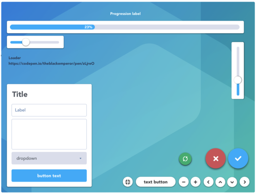
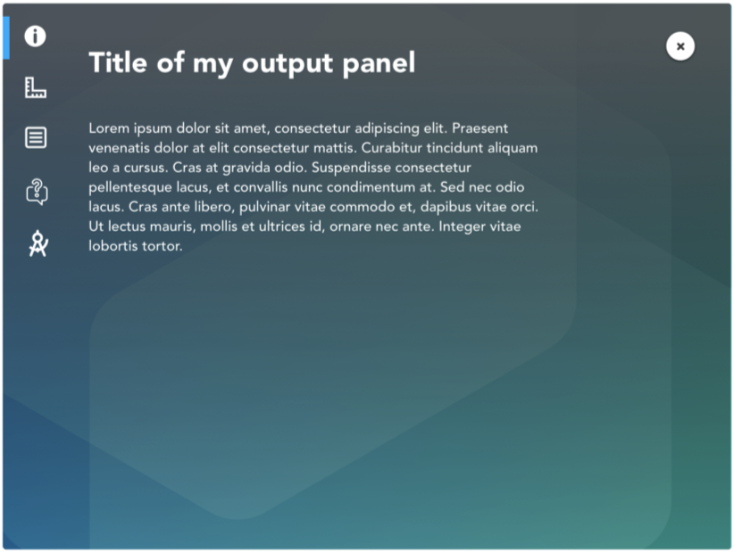
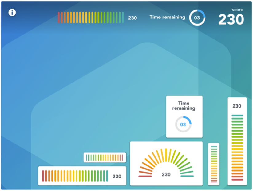
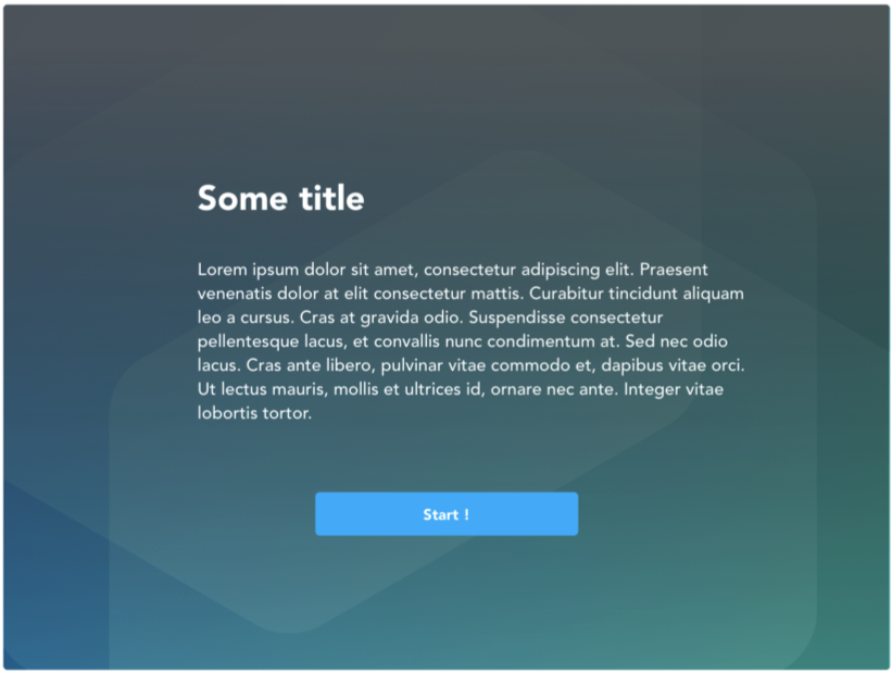
Design
The design for the UI controls also includes plans for:
- a platform-linked refresh button
- slider
- progress bar
- timers
- meters
- forms including text fields and combo boxes
- modal dialogs
- multi-page overlay
- success page